HBDStats now has Hive stats! Since my last update back in April I have added more elements to the web. Let’s take a look!
Let’s take a look.
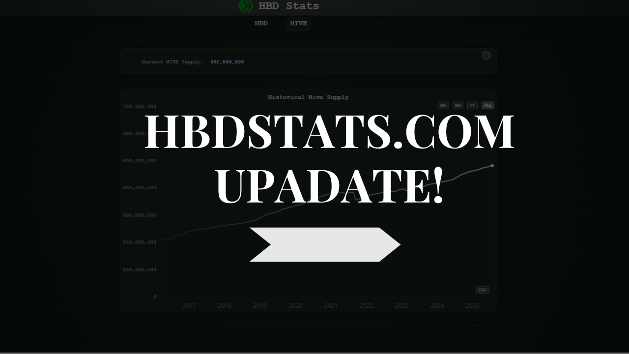
First and foremost, there is now a new tab on the top with the HBD and HIVE options:

When you toggle on the HBD tab there are the options:
- Debt
- Savings
- HBD Supply
- DHF Supply
- Cumulative
- Interest
Most of these were there before the update, except for the interest chart, that is now new.
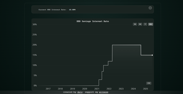
Here we can see the historic move of the interest rate for HBD in savings. We can see that prior to 2021 there was no interest for HBD, then a series of few adjustments on the upside, up to 20% and then a drop to the current 15%.
Having historic HBD interest is a vital parameter that users holding HBD in savings should have in mind, and to note that this parameter is dynamic and has seen changes in the past, based on what then users can bring their conclusions about HBD allocation.
Hive Stats
On the totally new addition, the hive tab, currently we have this:
- Hive Supply
- Hive Power
- Active Accounts
- Transactions
The Hive supply is obviously a key parameter, as for any other blockchain.
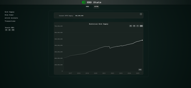
The supply and the inflation rate are something that is closely monitored from the community, as it represents the debasement of the token holders, and when corelated to the staking rewards it gives users, info are they beating inflation with their earnings. On top of this there is info on the current supply data. As for the other chart, users can change the timeframe to 1Y and less. Additionally, as for the other charts, there is a download button for the token supply in CSV form, with daily data back from 2016 that anyone can use in their analysis.
Going forward I will add another chart with the inflation data represented in % units.
Next on the list is the Hive Power data:
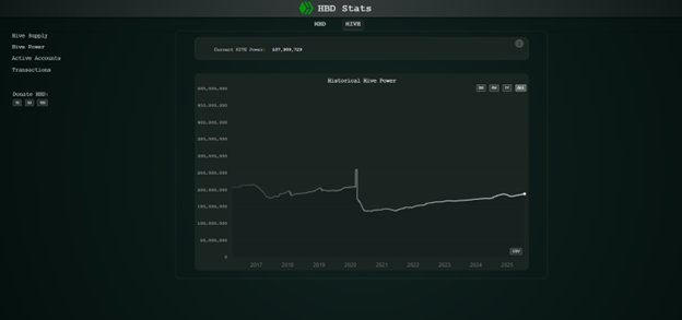
Another key parameter is how much of the token supply is staked, or in this case powered up. Here we have an overview from the very beginning of the chain back in 2016. The option for choosing a different timeframe is here as well and the download button. Another interesting parameter that can be added here is the share of the Hive Powered up, currently at 39%. A historic chart can be a good representation for this as well.
Daily Active Accounts
Another key parameter, daily active accounts!
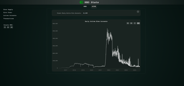
Here as well we have a historical data going all the way back. Note that the number of active accounts is for all types of operations, and the massive spike back in 2021 is due to the explosion in the activity on Splinterlands. Going forward a breakdown of the active accounts by operation can be included, like account posting, voting, custom_json, transfers, etc.
Number of Transactions per Day
Another key parameter, the activity on the chain, or the number of transactions per day.
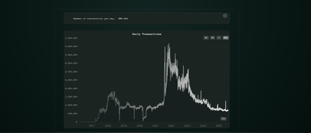
This chart as for the active accounts includes all types of operations made, the options for adding a further breakdown by type of operations can be implemented here as well.
Future Plans
As already pointed out, I do plan to add a few more charts, especially on the Hive side, including the inflation rate, share of Hive powered up, and breakdown of the activity and transactions by type of operation.
On the HBD side, there can be more aditions, like daily paid HBD interest, DHF payouts, top holders etc.
Another major addition I plan to add is data on the Splinterlands tokens, SPS and DEC. I do post now from time to time about the supply and inflation of these tokens, but getting data on the historical supply can be a challenge. There are APIs that Splinterlands provide for the current supply, from where I can make daily snapshots and create a timeseries.
Support the Project
The web has a nice amount of data and charts now, from the early beginning, where there was only one chart. It is a full stack web, with a backend, its own database and APIs. While I do this for personal pleasure, growth and to upscale my skills, any appreciation is more than welcomed. It will for sure boost motivation and speed up the development :). I dont know exactly how many hours I have put in it till now, but it is a lot. For sure I do plan to put all the code on github, and the data is free to be downloaded even now, for every chart.
I have integrated donation buttons in HBD, for anyone that finds the provided data useful. The transactions lead to keychain link with all the safety measures in place, first choose account, and then confirm the transaction.

If you have any additional proposals, feedback and addition you want to see in the web, let me know in the comments!
All the best @dalz
Comments (12)
Nice updates, as a stats junky myself I approve!
@tipu curate
Upvoted 👌 (Mana: 44/54) Liquid rewards.
This chart is most interesting to me:
The breakdown by operation to isolate Splinterlands and other top daily active users would be MOST helpful!
This site is fantastic. HBD Stats is somewhat deceiving and sets lower expectations for what it really is! This is the first time I saw this site BTW...
Thanks! I'm awere about the naming :) ... it just evolved naturaly from the first version ... depending where it go from here, might change it into something else :)
It is already a lot more than HBD Stats :)
This chart shows the death of hive while under the control of people who, maybe "reasonable" developers, but who clearly have zero idea what they are regarding marketing and allocation of community marketing funds. Things need to change. and soon.
I am not expressing an opinion on your statement here, but this chart is showing an explosion of daily users that happened because of Splinterlands. Unfortunately those 500K+ Splinterlands daily users were not real humans but mostly bots...
checkinwith.xyz is a proof of person tool on Hive. It can help to prove the user base is real and is growing. but we have to do the work
Beautiful. Nicely done man.
Thanks!
Nice site! It's great to see HBD get more attention! 😉🙂👊
Fantastic site
Great stats. this site (especially the Hive part of it) shows the health of the Hive Blockchain overall. Sadly, it clearly shows that the chain is dying.
the main factor here is the incredible mis-approporiation of millions of dollars of marketing money that has essentially been dumped onto the market without a single KPI or measurable benefit provided to the communtiy. So far this year only one of the "marketing" projects has provided KPI's. It demonstrates a huge disrespect to community money.
I have hope that over the coming months / years we will organise our marketing initiatives EXCLUSIVELY around KPI's onboarding numbers and measurables that show a clear benefit to the chain. If no benefit is shown, the marketing money can be redirected to where KPIs show it is performing best and away from under performing projects.
Once that starts happening, we will start seeing an uptick in the active users charts and amount of staked HP charts (essentially the only two charts needed to see if Hive is healthy and growing or dying (as it is now))
These stats must be used to show that developers are NOT marketers and they are in-fact awful marketers. They need to step aside to professionals who can better deploy funding going forwards.
You are peobably refrering to DAUs and tranactions chart. Have in mind those are a bit scued from the Splinterlands activity back in 2021 as there was a lot of botting back then and a lot of transactions put on chain, that Splinterlands later cut them off themseslf to not be stored on chain. If taken into account only the posting activity it will not be as dramatic.
That said, yes the overall activity is still down. About the marketing side, I cant really comment as I'm not the expert there. But for sure having some metric for community funds spent is not a bad idea at all.
Even without the splinterlands activity, that charts is going downwards. We have spent millions and millions of dollars on marketing and this chart is still going down, also almost none of the marketing dollars spent are tied to any KPIs such as users onboarded, deals made, HP purchased etc
Great Young Man 😎
Awesome work! Always exciting to see tools that make Hive and HBD data more accessible and insightful. Keep it up! 🚀📊
This is a good thing, it helps us to know how much the demand and supply of these things is, and we start to know many things. We also know the progress of our account, so this tool is very useful.
3 years of daily users and transactions going down 📉 that trend needs to change.
Check out our last posts: